
我们生活的环境是3D的,照片就是3D物体在2D平面呈现的例子。
有什么特点
- 近大远小。
- 物体后面遮挡不可见
当我们在网页上构建3D效果的时候参考这些特点就能产出3D效果。 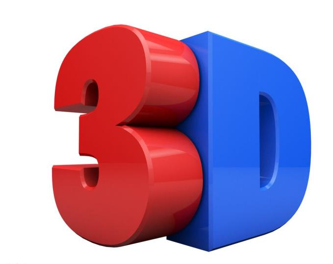
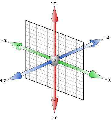
1.三维坐标系
三维坐标系其实就是指立体空间,立体空间是由3个轴共同组成的。
- x轴: 水平向右 注意: x 右边是正值,左边是负值
- y轴: 垂直向下 注意: y 下面是正值,上面是负值
- z轴: 垂直屏幕 注意: 往外面是正值,往里面是负值
2.3D移动translate3d
3D移动在2D移动的基础上多加了一个可以移动的方向,就是z轴方向。
ignorelang
translform:translateX(100px): 仅仅是在x轴上移动
translform:translateY(100px): 仅仅是在Y轴上移动
translform:translateZ(100px): 仅仅是在Z轴上移动(注意: translateZ一般用px单位)
transform:translate3d(x,y,z): 其中 x、y、z 分别指要移动的轴的方向的距离
注意:
- 因为z轴是垂直屏幕,由里指向外面,所以默认是看不到元素在z轴的方向上移动
translate3d(x,y,z)中xyz不能省略,如果没有就写0translateZ正数是向外移动(屏幕靠近眼睛方向),负数是向里面移动(屏幕远离眼睛方向)
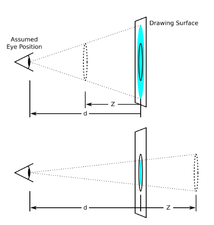
3.透视perspective
在2D平面产生近大远小视觉立体,但是只是效果二维的。
- 如果想要在网页产生3D效果需要透视(理解成3D物体投影在2D平面内)。
- 模拟人类的视觉位置,可认为安排一只眼睛去看
- 透视我们也称为视距: 视距就是人的眼睛到屏幕的距离
- 距离视觉点越近的在电脑平面成像越大,越远成像越小
- 透视的单位是像素
透视写在被观察元素的父盒子上面的
- d: 就是视距,视距就是一个距离人的眼睛到屏幕的距离。
- 就是 z轴,物体距离屏幕的距离,z轴越大(正值)我们看到的物体就越大。
html
<!DOCTYPE html>
<html lang="en">
<head>
    <meta charset="UTF-8">
    <meta name="viewport" content="width=device-width, initial-scale=1.0">
    <title>Document</title>
    <style>
        .d1 {
            float: left;
            perspective: 600px;
        }
        .d2 {
            width: 200px;
            height: 200px;
            background-color: palegoldenrod;
            transform: translate3d(400px,100px,100px);
        }
        .d3 {
            float: left;
            perspective: 200px;
        }
        .d4 {
            width: 200px;
            height: 200px;
            background-color: palegoldenrod;
            transform: translate3d(400px,100px,100px);
        }
    </style>
</head>
<body>
    <div class="d1">
        <div class="d2"></div>
    </div>
    <div class="d3">
        <div class="d4"></div>
    </div>

</body>
</html>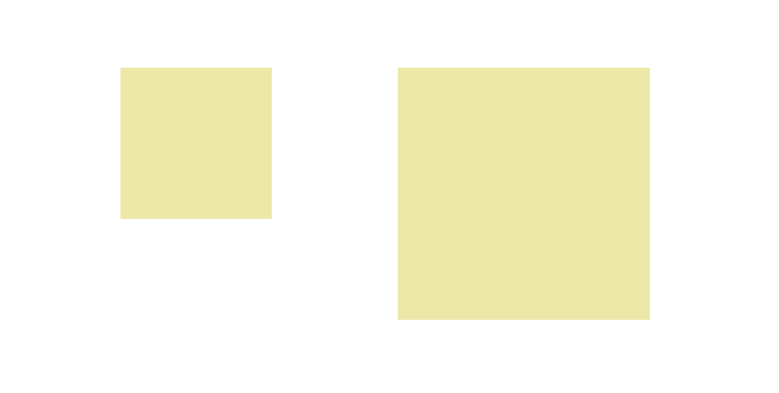
4.translateZ
translform:translateZ(100px): 仅仅是在Z轴上移动。
有了透视,就能看到translateZ引起的变化了
- translateZ:近大远小
- translateZ:往外是正值
- translateZ:往里是负值
html
<!DOCTYPE html>
<html lang="en">
<head>
    <meta charset="UTF-8">
    <meta name="viewport" content="width=device-width, initial-scale=1.0">
    <title>Document</title>
    <style>
        body {
            perspective: 500px;
        }
        div {
            height: 200px;
            width: 200px;
            background-color: palegoldenrod;
            margin: 200px auto;
            transform: translateZ(0px);
        }
    </style>

</head>
<body>
    <div></div>
</body>
</html>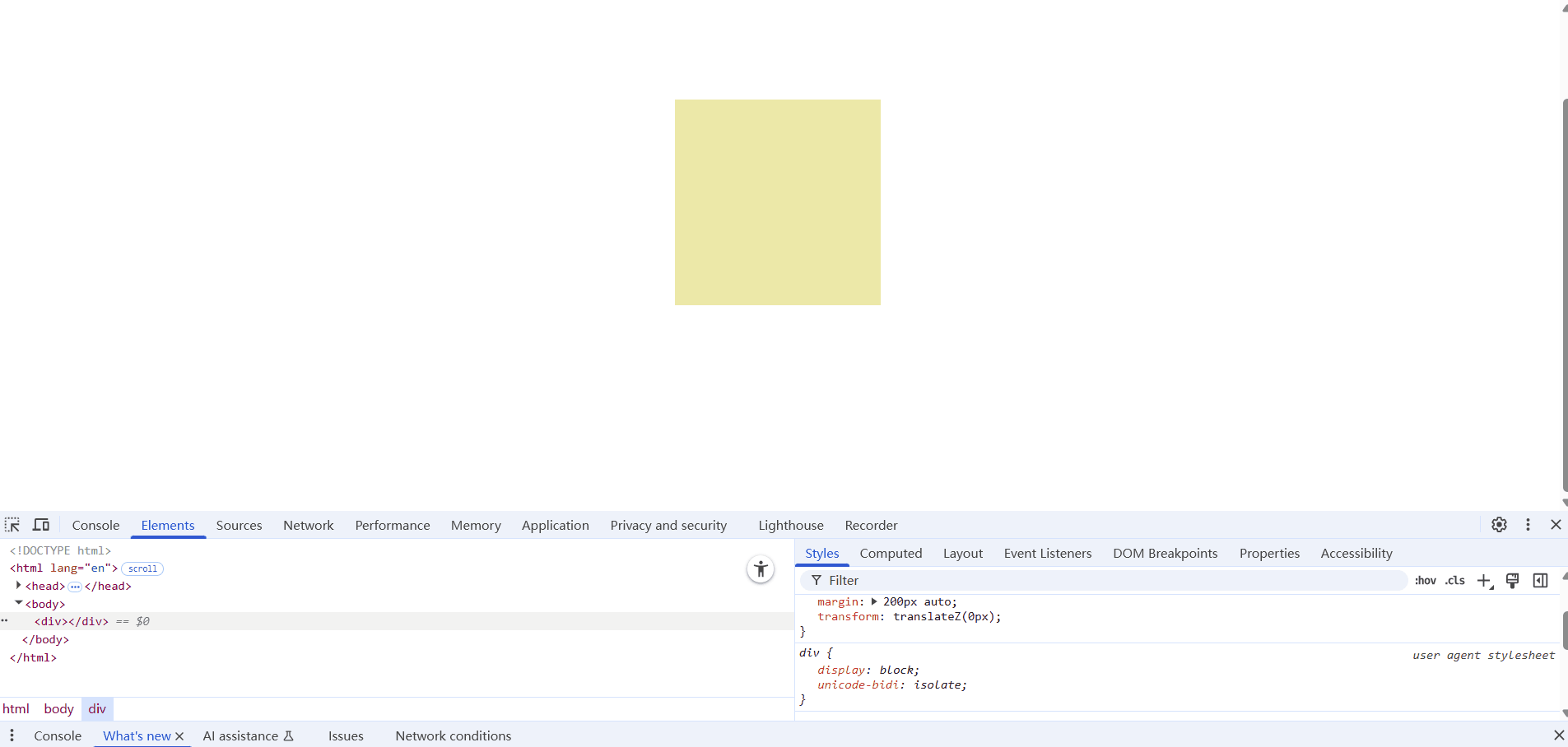
5.3D旋转-transform:rotateX()
可以让元素在三维平面内沿着x轴进行旋转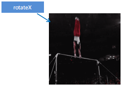
不加透视的翻转效果
html
<!DOCTYPE html>
<html lang="en">
<head>
    <meta charset="UTF-8">
    <meta name="viewport" content="width=device-width, initial-scale=1.0">
    <title>Document</title>
    <style>
        img {
            display: block;
            margin: 100px auto;
            transition: all 1s;
        }
        img:hover {
            transform: rotateX(180deg);
        }
    </style>
</head>
<body>
    <div>
        <img src="pig.jpg" alt="">
    </div>
</body>
</html>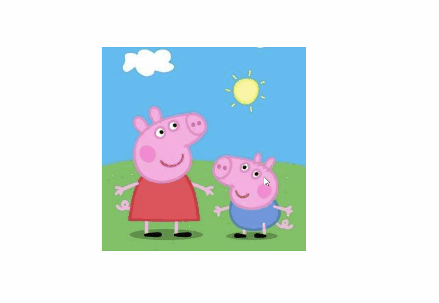
添加透视的翻转效果
html
<!DOCTYPE html>
<html lang="en">
<head>
    <meta charset="UTF-8">
    <meta name="viewport" content="width=device-width, initial-scale=1.0">
    <title>Document</title>
    <style>
        div {
            perspective: 400px;
        }
        img {
            display: block;
            margin: 100px auto;
            transition: all 1s;
        }
        img:hover {
            transform: rotateX(180deg);
        }
    </style>
</head>
<body>
<div>
    <img src="pig.jpg" alt="">
</div>
</body>
</html>
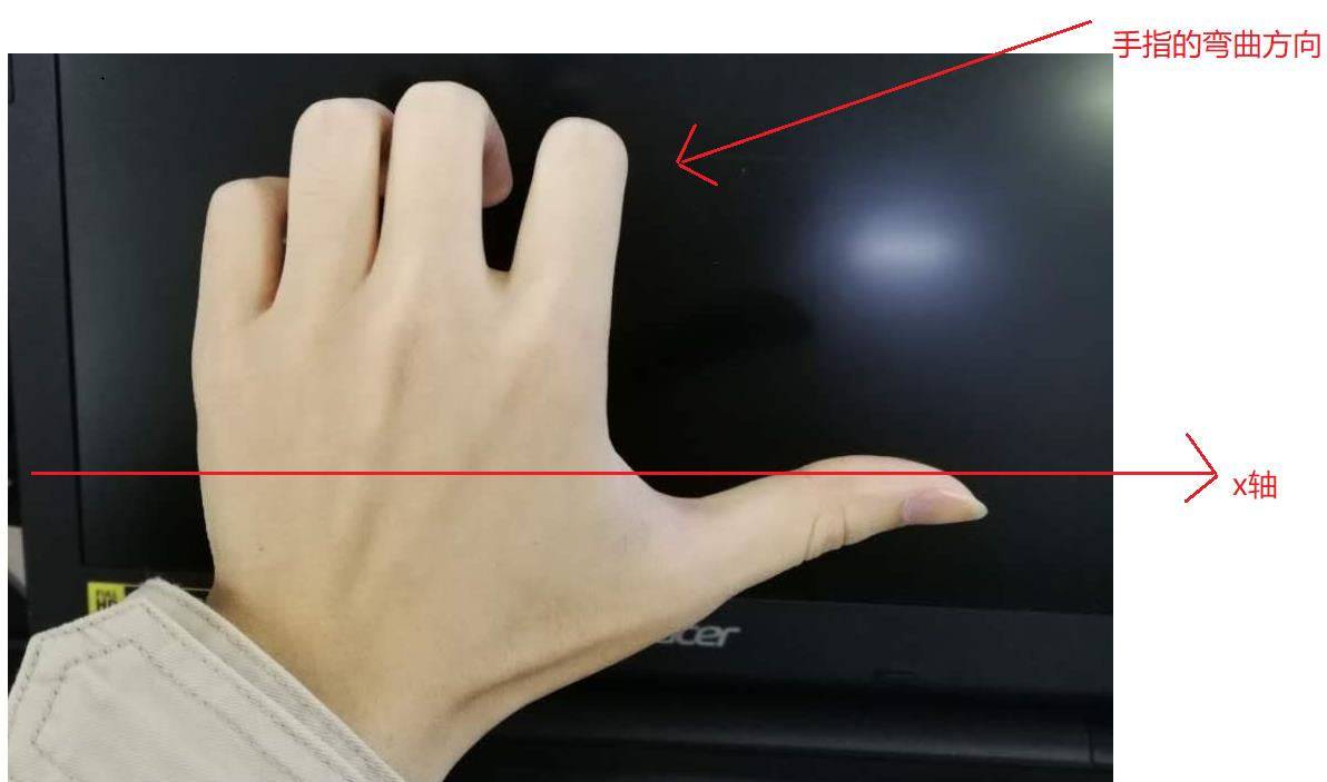
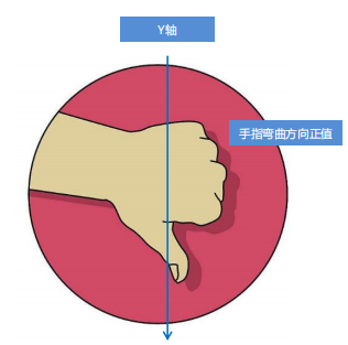
对于元素旋转的方向的判断-左手准则。
- 左手的手拇指指向 x轴的正方向
- 其余手指的弯曲方向就是该元素沿着x轴旋转的方向
旋转度数为正45度
html
<!DOCTYPE html>
<html lang="en">
<head>
    <meta charset="UTF-8">
    <meta name="viewport" content="width=device-width, initial-scale=1.0">
    <title>Document</title>
    <style>
        div {
            perspective: 300px;
        }
        img {
            display: block;
            margin: 100px auto;
            transition: all 1s;
        }
        img:hover {
            transform: rotateX(45deg);
        }
    </style>
</head>
<body>
    <div>
        <img src="pig.jpg" alt="">
    </div>
</body>
</html>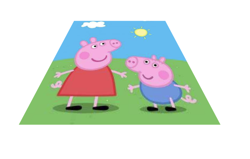
旋转度数为负45度
html
<!DOCTYPE html>
<html lang="en">
<head>
    <meta charset="UTF-8">
    <meta name="viewport" content="width=device-width, initial-scale=1.0">
    <title>Document</title>
    <style>
        div {
            perspective: 300px;
        }
        img {
            display: block;
            margin: 100px auto;
            transition: all 1s;
        }
        img:hover {
            transform: rotateX(-45deg);
        }
    </style>
</head>
<body>
    <div>
        <img src="pig.jpg" alt="">
    </div>
</body>
</html>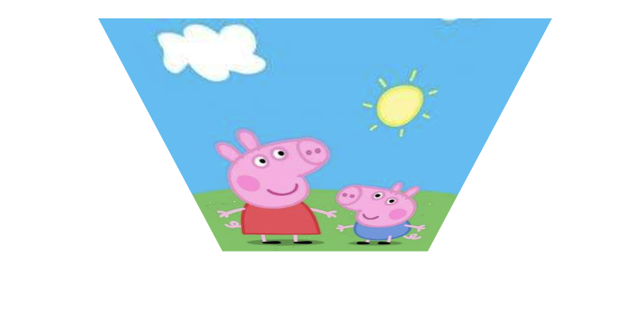
6.3D旋转-transform:rotateY()
可以让元素在三维平面内沿着y轴进行旋转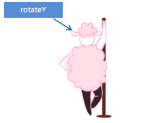
不加透视的翻转效果
html
<!DOCTYPE html>
<html lang="en">
<head>
    <meta charset="UTF-8">
    <meta name="viewport" content="width=device-width, initial-scale=1.0">
    <title>Document</title>
    <style>

        img {
            display: block;
            margin: 100px auto;
            transition: all 1s;
        }
        img:hover {
            transform: rotateY(180deg);
        }
    </style>
</head>
<body>
    <div>
        <img src="pig.jpg" alt="">
    </div>
</body>
</html>
添加透视的翻转效果
html
<!DOCTYPE html>
<html lang="en">
<head>
    <meta charset="UTF-8">
    <meta name="viewport" content="width=device-width, initial-scale=1.0">
    <title>Document</title>
    <style>
        div {
            perspective: 400px;
        }
        img {
            display: block;
            margin: 100px auto;
            transition: all 1s;
        }
        img:hover {
            transform: rotateY(180deg);
        }
    </style>
</head>
<body>
    <div>
        <img src="pig.jpg" alt="">
    </div>
</body>
</html>
对于元素旋转的方向的判断-左手准则。
- 左手的手拇指指向 y轴的正方向
- 其余手指的弯曲方向就是该元素沿着y轴旋转的方向(正值)
旋转度数为正45度
html
<!DOCTYPE html>
<html lang="en">
<head>
    <meta charset="UTF-8">
    <meta name="viewport" content="width=device-width, initial-scale=1.0">
    <title>Document</title>
    <style>
        div {
            perspective: 400px;
        }
        img {
            display: block;
            margin: 100px auto;
            transition: all 1s;
        }
        img:hover {
            transform: rotateY(45deg);
        }
    </style>
</head>
<body>
    <div>
        <img src="pig.jpg" alt="">
    </div>
</body>
</html>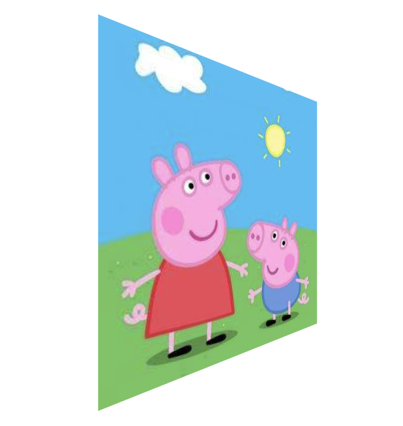
旋转度数为负45度
html
<!DOCTYPE html>
<html lang="en">
<head>
    <meta charset="UTF-8">
    <meta name="viewport" content="width=device-width, initial-scale=1.0">
    <title>Document</title>
    <style>
        div {
            perspective: 400px;
        }
        img {
            display: block;
            margin: 100px auto;
            transition: all 1s;
        }
        img:hover {
            transform: rotateY(-45deg);
        }
    </style>
</head>
<body>
    <div>
        <img src="pig.jpg" alt="">
    </div>
</body>
</html>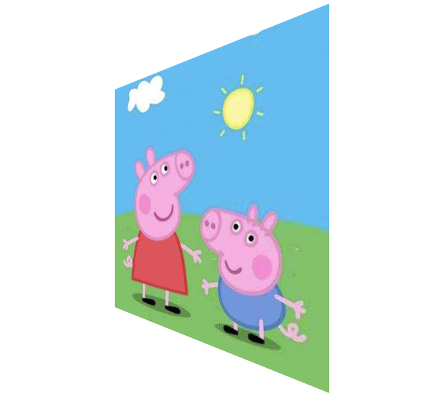
7.3D旋转-transform:rotateZ()
可以让元素在三维平面内沿着z轴进行旋转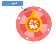
html
<!DOCTYPE html>
<html lang="en">
<head>
    <meta charset="UTF-8">
    <meta name="viewport" content="width=device-width, initial-scale=1.0">
    <title>Document</title>
    <style>
        div {
            perspective: 400px;
        }
        img {
            display: block;
            margin: 100px auto;
            transition: all 1s;
        }
        img:hover {
            transform: rotateZ(180deg);
        }
    </style>
</head>
<body>
    <div>
        <img src="pig.jpg" alt="">
    </div>
</body>
</html>
8.3D旋转-transform:rotate3d()
transform:rotate3d(x,y,z,deg): 沿着自定义轴旋转deg为角度(了解即可)
xyz是表示旋转轴的矢量,是标示你是否希望沿着该轴旋转,最后一个标示旋转的角度。
- transform:rotate3d(1,0,0,45deg) 就是沿着x轴旋转 45deg
html
<!DOCTYPE html>
<html lang="en">
<head>
    <meta charset="UTF-8">
    <meta name="viewport" content="width=device-width, initial-scale=1.0">
    <title>Document</title>
    <style>
        div {
            perspective: 400px;
        }
        img {
            display: block;
            margin: 100px auto;
            transition: all 1s;
        }
        img:hover {
            transform: rotate3d(1,0,0,45deg);
        }
    </style>
</head>
<body>
    <div>
        <img src="pig.jpg" alt="">
    </div>
</body>
</html>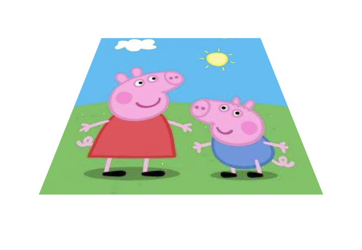
- transform:rotate3d(1,1,0,45deg) 就是沿着对角线旋转 45deg
html
<!DOCTYPE html>
<html lang="en">
<head>
    <meta charset="UTF-8">
    <meta name="viewport" content="width=device-width, initial-scale=1.0">
    <title>Document</title>
    <style>
        div {
            perspective: 400px;
        }
        img {
            display: block;
            margin: 100px auto;
            transition: all 1s;
        }
        img:hover {
            transform: rotate3d(1,1,0,45deg);
        }
    </style>
</head>
<body>
    <div>
        <img src="pig.jpg" alt="">
    </div>
</body>
</html>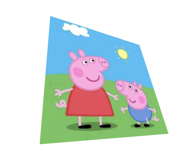
- transform:rotate3d(1,1,1,45deg) 就是沿着对角线旋转还有z轴都是45deg
html
<!DOCTYPE html>
<html lang="en">
<head>
    <meta charset="UTF-8">
    <meta name="viewport" content="width=device-width, initial-scale=1.0">
    <title>Document</title>
    <style>
        div {
            perspective: 400px;
        }
        img {
            display: block;
            margin: 100px auto;
            transition: all 1s;
        }
        img:hover {
            transform: rotate3d(1,1,1,45deg);
        }
    </style>
</head>
<body>
    <div>
        <img src="pig.jpg" alt="">
    </div>
</body>
</html>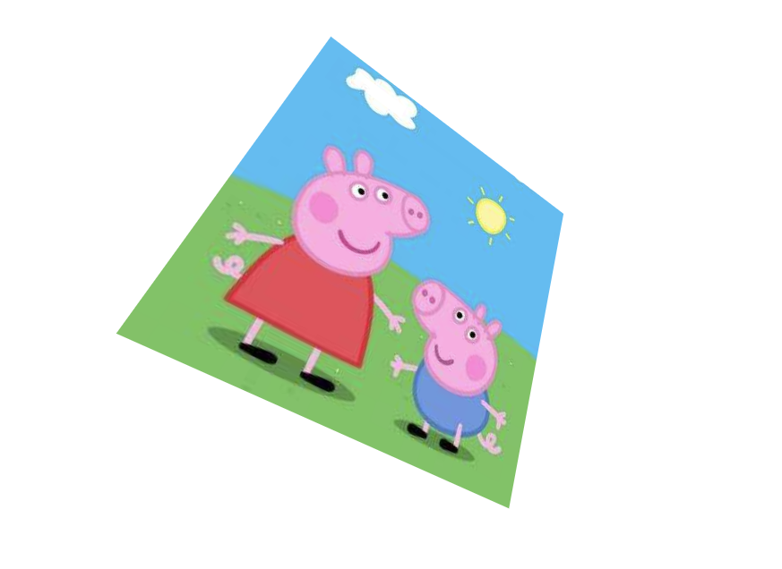
9.3D呈现transfrom-style
- 控制子元素是否开启三维立体环境。
transform-style: flat子元素不开启3d立体空间 默认的transform-style: preserve-3d;子元素开启立体空间- 代码写给父级,但是影响的是子盒子
- 这个属性很重要,后面必用
如果不开启三维立体环境 
html
<!DOCTYPE html>
<html lang="en">
<head>
    <meta charset="UTF-8">
    <meta name="viewport" content="width=device-width, initial-scale=1.0">
    <title>Document</title>
    <style>
        body {
            perspective: 500px;
        }
        .box {
            position: relative;
            height: 200px;
            width: 200px;
            margin: 100px auto;
            transition: all 1s;

        }
        .box:hover {
            transform: rotateY(60deg);
        }
        .box div {
            position: absolute;
            top: 0;
            right: 0;
            height: 100%;
            width: 100%;
            background-color: pink;
        }
        .box div:last-child {
            background-color: purple;
            transform: rotateX(60deg);
        }

    </style>
</head>
<body>
    <div class="box">
        <div></div>
        <div></div>
    </div>
</body>
</html>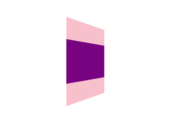
开启后 
html
<!DOCTYPE html>
<html lang="en">
<head>
    <meta charset="UTF-8">
    <meta name="viewport" content="width=device-width, initial-scale=1.0">
    <title>Document</title>
    <style>
        body {
            perspective: 500px;
        }
        .box {
            position: relative;
            height: 200px;
            width: 200px;
            margin: 100px auto;
            transition: all 1s;
            transform-style: preserve-3d;
        }
        .box:hover {
            transform: rotateY(60deg);
        }
        .box div {
            position: absolute;
            top: 0;
            right: 0;
            height: 100%;
            width: 100%;
            background-color: pink;
        }
        .box div:last-child {
            background-color: purple;
            transform: rotateX(60deg);
        }

    </style>
</head>
<body>
    <div class="box">
        <div></div>
        <div></div>
    </div>
</body>
</html>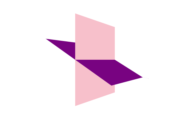
10.案例-两面翻转的盒子
html
<!DOCTYPE html>
<html lang="en">
<head>
    <meta charset="UTF-8">
    <meta name="viewport" content="width=device-width, initial-scale=1.0">
    <title>Document</title>
    <style>
        .box {
            position: relative;
            height: 200px;
            width: 200px;
            margin: 100px auto;
            transition: all 1s;
            transform-style: preserve-3d;
        }
        .box:hover {
            transform: rotateY(180deg);
        }
        .front,.back {
            position: absolute;
            top: 0;
            left: 0;
            height: 100%;
            width: 100%;
            border-radius: 50%;
            text-align: center;
            line-height: 200px;
            color: #fff;
        }
        .front {
            background-color: pink;
            z-index: 1;
            /** 防止粉色翻过来还是在上面 **/
            backface-visibility: hidden;
        }
        .back {
            background-color: plum;
            transform: rotateY(180deg);
        }
    </style>
</head>
<body>
    <div class="box">
        <div class="front">请翻开</div>
        <div class="back">全栈实验室</div>
    </div>
</body>
</html>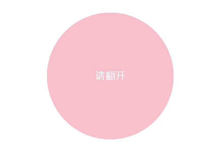
11.案例-3D导航栏
html
<!DOCTYPE html>
<html lang="en">

<head>
    <meta charset="UTF-8">
    <meta name="viewport" content="width=device-width, initial-scale=1.0">
    <title>Document</title>
    <style>
        * {
            margin: 0;
            padding: 0;
        }

        ul {
            margin: 100px;
        }

        ul li {
            float: left;
            margin: 0 5px;
            width: 150px;
            height: 35px;
            list-style: none;
            perspective: 500px;
        }

        .box {
            position: relative;
            height: 100%;
            width: 100%;
            transform-style: preserve-3d;
            transition: all 1s;
        }

        .box:hover {
            transform: rotateX(90deg);
        }

        .front,
        .bottom {
            position: absolute;
            top: 0;
            left: 0;
            height: 100%;
            width: 100%;
        }

        .front {
            background-color: pink;
            z-index: 1;
            transform: translateZ(17.5px);
            text-align: center;
            line-height: 35px;
        }

        .bottom {
            background-color: plum;
            transform: translateY(17.5px) rotateX(-90deg);
            text-align: center;
            line-height: 35px;
        }
    </style>
</head>

<body>
    <ul>
        <li>
            <div class="box">
                <div class="front">全栈实验室</div>
                <div class="bottom">Java</div>
            </div>
        </li>
        <li>
            <div class="box">
                <div class="front">全栈实验室</div>
                <div class="bottom">前端</div>
            </div>
        </li>
        <li>
            <div class="box">
                <div class="front">全栈实验室</div>
                <div class="bottom">python</div>
            </div>
        </li>
        <li>
            <div class="box">
                <div class="front">全栈实验室</div>
                <div class="bottom">嵌入式</div>
            </div>
        </li>
        <li>
            <div class="box">
                <div class="front">全栈实验室</div>
                <div class="bottom">游戏</div>
            </div>
        </li>
    </ul>
</body>

</html>
12.案例-旋转木马
html
<!DOCTYPE html>
<html lang="en">
<head>
    <meta charset="UTF-8">
    <meta name="viewport" content="width=device-width, initial-scale=1.0">
    <title>Document</title>
    <style>
        body {
            perspective: 1000px;
        }
        section {
            position: relative;
            height: 300px;
            width: 300px;
            margin: 200px auto;
            transform-style: preserve-3d;
            animation: dog 10s linear infinite;
            background: url(dog.jpg) no-repeat;
        }
        section:hover {
            animation-play-state: paused;
        }
        @keyframes dog {
            0% {
                transform: rotate(0deg);
            }
            100% {
                transform: rotateY(360deg);
            }
        }
        div {
            position: absolute;
            top: 0;
            left: 0;
            height: 100%;
            width: 100%;
            background: url(dog.jpg) no-repeat;
        }
        section div:nth-child(1){
            transform: translateZ(300px);
        }
        section div:nth-child(2){
            transform: rotateY(60deg) translateZ(300px);
        }
        section div:nth-child(3){
            transform: rotateY(120deg) translateZ(300px);
        }
        section div:nth-child(4){
            transform: rotateY(180deg) translateZ(300px);
        }
        section div:nth-child(5){
            transform: rotateY(240deg) translateZ(300px);
        }
        section div:nth-child(6){
            transform: rotateY(300deg) translateZ(300px);
        }
    </style>
</head>
<body>
    <section>
        <div></div>
        <div></div>
        <div></div>
        <div></div>
        <div></div>
        <div></div>
    </section>
</body>
</html>
13.浏览器私有前缀
-moz-: 代表 firefox 浏览器私有属性-ms-: 代表 ie 浏览器私有属性-webkit-: 代表 safari、chrome 私有属性-o-: 代表 Opera 私有属性
提倡写法
ignorelang
-moz-border-radius: 10px;
-webkit-border-radius: 10px;
-o-border-radius: 10px;
border-radius: 10px;